Duotone SVG Icons

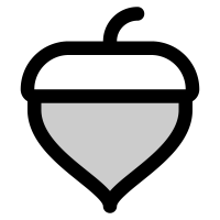
Duotone icons use two shades of the same color — a solid base with a lighter or darker secondary layer — to add a bit of depth without going fully illustrative. This collection groups libraries built specifically around that two-tone approach (Duoicons, IconPark TwoTone, Pepicons Print) alongside libraries that offer duotone as one of several styles (Phosphor, Solar, Ultimate Free Icons), for interfaces that want more visual interest than a flat outline icon but less commitment than a full-color illustration.

6 icon packs·Free & open source

Common Use Cases

  • 1

    Dashboard and analytics UIs wanting subtle depth without full-color illustrations

  • 2

    Feature sections on marketing pages needing icons with more visual weight than outlines

  • 3

    Design systems offering a 'duotone' variant alongside outline and filled styles

  • 4

    Fintech and SaaS product interfaces going for a modern, layered icon aesthetic

  • 5

    Onboarding and empty states wanting icons that feel more polished than single-color

  • 6

    Pricing pages and plan comparisons using duotone icons to highlight included features

  • 7

    Mobile app interfaces wanting a distinct, branded icon style

Frequently Asked Questions

Yes, at its core — a duotone icon uses two tones (often two shades of the same hue) applied to different layers of the same shape, typically a solid base at full opacity and a secondary layer at reduced opacity or a lighter shade. This creates a sense of depth or layering without needing a fully illustrated, multi-color icon.

The Colored collection includes icons with multiple distinct colors or full illustrative shading (like Streamline Color or Plump Color), while this collection is specifically limited to the two-tone technique — one color, two opacities or shades. Duotone icons are generally more restrained and easier to fit into a single brand color than fully multi-color icons.

This depends on the library. Some duotone icons (like Duoicons) are built with CSS variables or 'currentColor' for both layers, letting you recolor the whole icon while preserving the two-tone effect. Others may have fixed colors baked into the SVG. Check the pack page to confirm before assuming it'll follow your theme.

Duoicons, IconPark TwoTone, and Pepicons Print are built specifically as duotone sets. Phosphor, Solar, and Ultimate Free Icons offer duotone as one style among several (alongside outline, filled, etc.), so if you want the flexibility to switch styles later while keeping the same icon shapes, those multi-style libraries are worth considering.

They can lose some of their layered effect at very small sizes, since the secondary tone becomes harder to distinguish from the base. If you need icons below 20px, it's worth previewing a specific icon at that size, since simpler duotone icons tend to hold up better than more detailed ones.

Each icon keeps the license from its source library attached to it, and terms can differ between Duoicons, IconPark TwoTone, Pepicons Print, Phosphor, Solar, Ultimate Free Icons, and other included libraries. Check the license shown on the individual icon or pack page before using it commercially.

It's best to avoid this, since the exact opacity ratio, corner style, and level of detail vary between duotone libraries even though they share the same general technique. Sticking to one library keeps the layered effect looking consistent across your interface.